

ux-intro
ux work
ux-intro
ux work

ux-01
ux design process
Research, Design, Build, & Track
ux-01
ux design process
Research, Design, Build, & Track
The Home Depot - My Account Redesign
In this section, I would like to highlight the process I go through when starting a large-scale redesign. This same process can also be used for net new products and large feature enhancements. For smaller features and products I typically use a process that is a bit more streamlined. However; with any of these UX projects, I must always start with identifying and framing the problem. I do this by creating a problem statement, and a problem statement is a concise description of the problem that needs to be solved.
Definition
Problem Statment:
Our online customers are having difficulties navigating and finding their previous orders. This is a problem because customers that convert often and especially pro customers typically review and reorder from their order history located within the “My Account” section.
Short Term
Orders will be condensed into a single database including Online, In-Store, Special, and Installation Orders.
Dynamic "My Account" landing page will include recent orders and tracking. Most recently used sections will be prioritized.
Orders will be easier to find and sort by adding product images to the order summaries.
Unused features will be removed.
Long Term
Integrate account benefits throughout browse and search paths (with customer value)
Account widget for new data-driven home page
Integrating credit card payment into "My Account"
Linking and saving Gift Cards to your account within "My Credit Cards"
Bring in digital content (Guides/Resources/Inspiration etc) into "My Account" by introducing "Save This".
Introduce Registries & Subscriptions.
The New My Account Landing Page
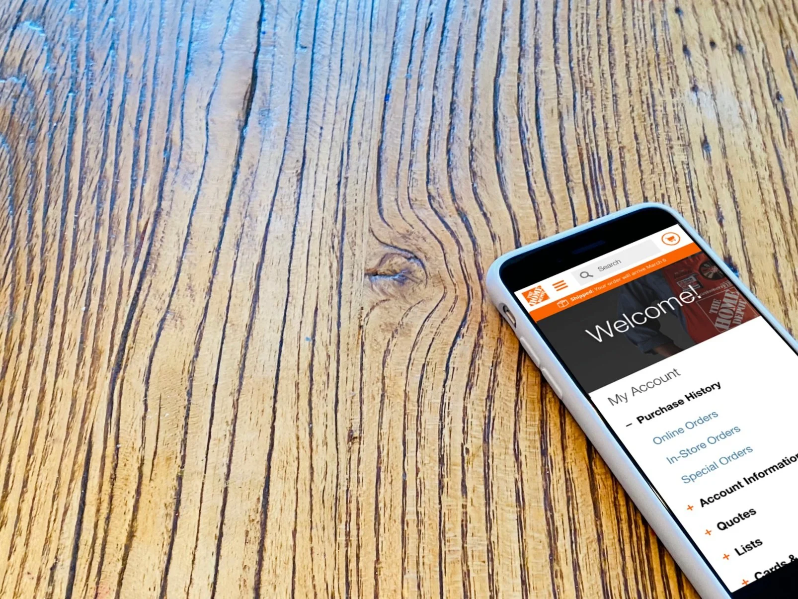
The old My Account landing page was basically a page of links with none of the summary views you see above. With this new landing page, customers are able to review their recent order history and go directly into the details to reorder or view product details directly from this landing page. This reduced the customer’s pain points and increased conversion by allowing frictionless access to make reorders.
Research
When I started at The Home Depot back in 2011 we didn’t have the research and analytics teams we do today. We would look at the site analytics ourselves and conduct in-person shop-along interviews with customers to help us build personas and journey maps. The research teams we have today are amazing at doing deep dives into the customer’s journeys and finding the pain points.
Strategy
HMW (How Might We) solve this problem statement. I have facilitated and participated in many design sprints and have found that conducting a design sprint with stakeholders, product managers, developers, researchers, and UX can nail down the strategy so all acting teams are in alignment and working to a single goal.
Implement
As I start on architecting and designing I am looking at all the use cases and building prototypes to get in front of our customers to help assist with narrowing down the final design. Above you can see the final fulfillment matrix to show all flavors. View Prototype Sample
Deploy
This is where the rubber hits the road or the design hits the code. Having experience writing code and developing software comes in handy working with your engineering partners when building any feature. Here you can see how I broke down the different breakpoints so we could stack these cards apropiatly.
Launch
The moment of truth. Is this a better experience? What have we learned from T&T? With just a few minor adjustments we are ready to launch. This is when working closely and having good relationships with your engineering partners really pays off. I have also noticed the amount of fast-follow fixes has greatly been reduced since going from the waterfall to the agile process.
Measure & Optimise
The following is placeholder text known as “lorem ipsum,” which is scrambled Latin used by designers to mimic real copy. Suspendisse nec congue purus. Nullam sit amet nisi condimentum erat iaculis auctor. Class aptent taciti sociosqu ad litora torquent per conubia nostra, per inceptos himenaeos. Fusce at massa nec sapien auctor gravida in in tellus. Donec eu est non lacus lacinia semper.

ux-02
end to end
In-store, Online, & Mobile App Journey
ux-02
end to end
In-store, Online, & Mobile App Journey
The Home Depot - Appliance Shopping
Case Study
Before we began the online appliance shopping experience appliances were treated the same way as a general merchant item. After our initial dive into how shoppers were buying appliances on our site, we learned the online portion was mainly used for browsing available models and consumer research and purchasing was mostly being done in the store. Before we began designing we spent a lot of time in the stores with customers and associates to learn what we could offer online to make the buying experience better.
Some of the main points we found from this research were as follows:
Customers wanted to see the appliance up-close and in-person
They wanted delivery and haul-a-way options
They wanted options to bundle and save money
And they wanted to choose a protection plan
Designing a best-in-class Appliance experience
After our first round of appliances, research was complete and we had the end-to-end customer journey that went from online, app, and in-store we finalized the design that included some key features like:
Added a clear indication that shows the customer when an appliance is available at the showroom in your local store.
Including bundles and buy more save more discounts as part of the recommendation module.
And including Installation, Haul Away, and Protection Plan options within the buying path and highlighting them on the PIP within a new “What we Offer” module.
Installation and Protection Options
Confirmation Email
Order Status
End-to-End Collaboration
In addition to the front-end changes you can see here we also had to collaborate with many other teams to make this a complete end-to-end experience. As I mentioned we did spend a lot of time in stores interviewing associates and customers and as part of this project, there was also a larger enterprise component that included changes to the in-store process and signage. And a lot of backend engineering work had to be done as well including knowing when to display the “Showroom” badge and including salient points that didn’t exist before. And we also introduced a new image carousel along with the “Make Sure it Fits” imagery and videos. This was a great example of collaboration across the entire company, and I am very proud to have been on the team as the online lead designer.
Becoming the #2 appliance retailer
In the Furniture & Appliances market in the United States, homedepot.com is ranked #2 with > US$10,000m in 2020. Therefore, homedepot.com accounts for 10% - 15% of eCommerce net sales in this category. The top stores are amazon.com, homedepot.com and walmart.com.
ecommercedb.com
The Home Depot - Pro Experience
CASE STUDY
When we began the Home Depot Pro experience it would be a completely new experience for us. We just acquired Interline Brands (IBI) that same year and Amazon was also launching a B2B beta site. We took our current commerce site as a foundation and began adding in business features from our exclusive ProXtra site and from IBI to get a baseline Pro website launched as a pilot. Having this pilot site up and running then allowed us to get customer feedback and begin designing iterations for testing before turning it on for all our pro customers. Our experienced UX research team was able to startup a panel of pros that we could then begin getting quick pro-specific feedback.
Here are some things we would hear back from our pro research:
A loyalty program was very important to our pros as they would look at the Home Depot as a partner to their business.
A customized shopping experience based on their trad would help them save time.
They often reordered the same or similar products.
They wanted to set up quotes online to guarantee pricing to help them accurately bid on jobs.
Having purchasers added to the account to make runner purchasing more efficient.
End-to-End Collaboration
Much like the appliance experience, we launched a year earlier, launching a completely new pro website would take a lot of collaboration across the company. We facilitated several design sprints and included everyone from the business stakeholders, to In-store Pro Desk associates and the pros themselves to have a hand in shaping the online pro experience.
Pro Features
As we got ready to go prime time with our first B2B/Pro website some of the added features included:
The ProXtra loyalty reward program that tiers based on spending, allowing our pro customers to save as they spent more.
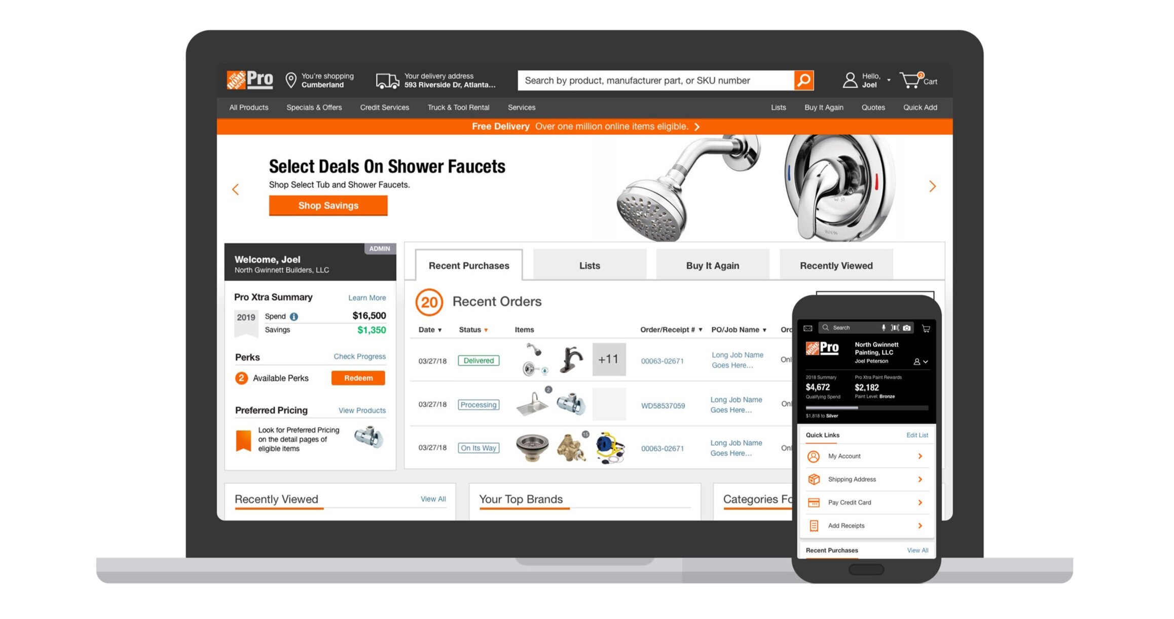
A personalized homepage with order history front and center along with quick links to important business tools.
An added “Buy it Again” for items that are frequently reordered.
Online quotes were also added so customers could lock in their carts to make it easier to bid on jobs.
And we also added Text-2-Confirm, allowing runners to make in-store Pro Desk purchases without a card in hand.
Some additional features we are also working on including soon are:
Pro-centered browse, including PLP table view.
Project Management Tools, including approved project lists, teams, and shared payments.
Custom catalogs, for printing and sharing, approved products.
And bin label printing and scanning for quick reordering from the app.
After launch Performance
“As we’ve mentioned all year, our smaller pro customers maintained consistent growth and posted strong double-digit growth in every month of the quarter,” Ted Decker, president and COO at Home Depot, said in the company’s fourth-quarter earnings call.
Ted Decker said the company has seen record enrollment and engagement in the program as well as record traffic on the company’s pro-dedicated app. Decker said Home Depot’s efforts are driving strong performance in the “stickiness and share” of the pro wallet.
prosalesmagazine.com

ux-03
design systems
Home Depot 2.0 Pattern Library
ux-03
design systems
Home Depot 2.0 Pattern Library
The Design Standard
As our UX team started to grow to multiple locations across the country our current design system which was just a GUI sketch file we shared, I volunteered to build and maintain our first true design system with guidelines, variants, drag and drop components, and a process for new components and iterations of old ones.
Structuring a system
I did a lot of research at first to see how other companies were structuring their internal design systems. I wanted our system to also be a UX repository for design components as well as documentation for other disciplines on the team including research and creative teams. The best and most convenient tool at the time was InVisions DSM sketch plugin.
HomeDepot.com 2.0
I used our newly redesigned website as the starting point for our new design system. We started a weekly team meeting with the designers from each workstream to go over and pressure test each of the new components and made updates and finalized them on the spot. As we grew the component library each new component would get guidelines that included the name of the creator if any clarity was needed, how and how not to use it, and examples with variants if required.
Sketch (DSM)
The Design System Manager (DSM) within sketch was a great solution for a design system but as we continued to grow and as components needed to go from design to code the DSM fell short.
Figma
Figma’s system libraries could allow us to use tokens to take the UI components from design to code utilizing a new repository we built called Harmony.
Home Depot’s Design System 2.0
We worked directly with our engineering partners to take our online design system from being a repository for just designers to a single system for both designers and developers across the organization including online, enterprise and merchandising.

ux-04
data science
Personalized Shopping Experiences
ux-04
data science
Personalized Shopping Experiences


